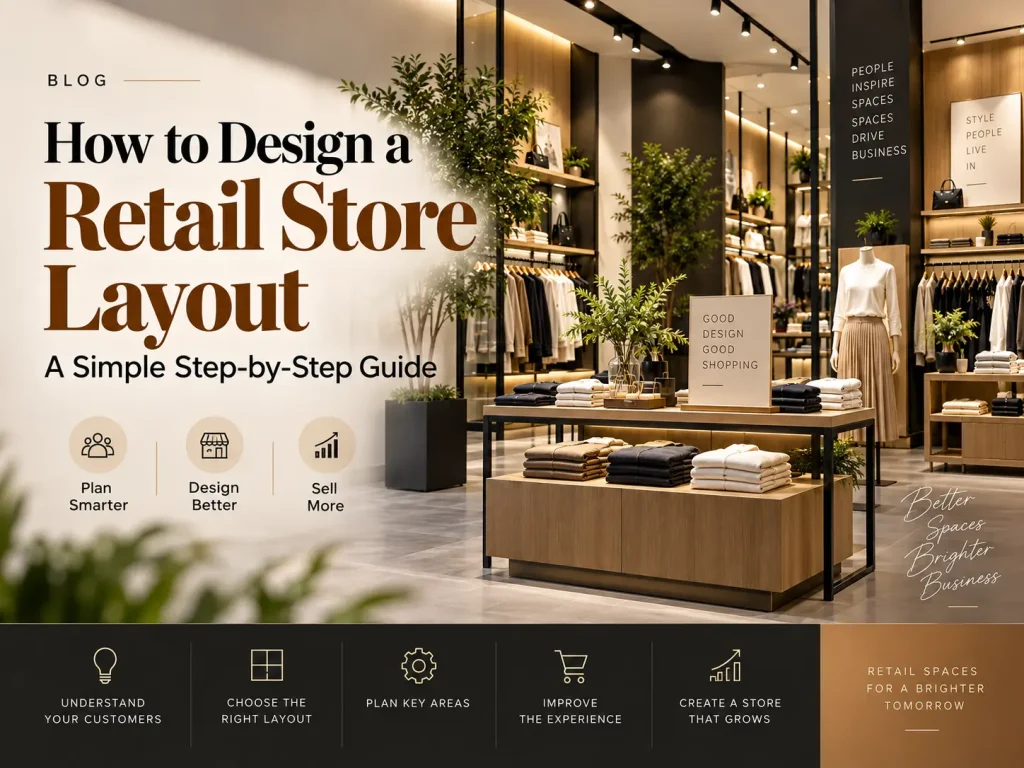
A good retail store layout makes it easy for customers to enter, find products, move around, compare items, and reach the checkout. To design a retail store layout, first understand your customers, measure the store, divide it into useful zones, choose the right floor plan, place important products in high-visibility areas, create clear paths, and test the layout using sales and customer-flow data. The layout should also leave enough space for staff, stock movement, checkout queues, safety, and future changes.
What Is a Retail Store Layout?
A retail store layout is the way products, shelves, displays, aisles, checkout areas, signs, lights, and other parts of a store are arranged.
The main goal is simple:
Help customers shop easily while making good use of the available space.
A store layout affects how people move, what they see first, which products they notice, and how easily they can find what they need.
A good layout should balance three things:
- Customer experience
- Product visibility
- Business operations
Smartsheet describes store layout as the strategic use of space to shape customer experience and customer flow. It also highlights the importance of floor plans, displays, fixtures, lighting, signage and customer movement.
Why Is Retail Store Layout Important?
Your store may have great products, but customers can still leave without buying if the store is hard to understand.
A good layout can help customers:
- Find products faster
- Move around comfortably
- Discover new products
- Compare similar products
- Notice special offers
- Find related products
- Reach the checkout easily
- Spend more time in useful areas
- Have a better shopping experience
For the business, a good layout can also help with:
- Better use of floor space
- Better product visibility
- Cross-selling
- Impulse buying
- Easier stock management
- Better staff movement
- Easier cleaning and maintenance
- Better customer flow
The important point is that a beautiful store is not always a good store. The layout must work for the customer and the people running the store.
What Should You Consider Before Designing a Retail Store Layout?
Do not start by placing shelves.
Start by understanding the store.
| Factor | Questions to Ask | Why It Matters |
|---|---|---|
| Store size | How many square feet do you have? | Determines how much space is available |
| Customer | Who shops here? | Helps decide flow and display style |
| Products | How many products do you sell? | Helps decide shelf and display density |
| Product size | Are products small or large? | Changes fixture requirements |
| Shopping mission | Do people browse or buy quickly? | Helps select the layout |
| Budget | How much can you spend? | Controls fixtures and technology |
| Staff | How many employees work inside? | Affects staff paths |
| Stock | How is stock brought to shelves? | Requires back-room access |
| Checkout | How many customers may queue? | Affects checkout space |
| Future needs | Will products or seasons change? | Makes flexibility important |
TruRating also highlights customer demographics, product categories, budget, seasonal products and changing customer preferences as important layout factors.
Step 1: Measure the Store
Before designing anything, measure the complete space.
Record:
- Total floor area
- Length and width
- Ceiling height
- Entrance width
- Exit location
- Windows
- Doors
- Columns
- Walls
- Stairs
- Toilets
- Electrical points
- Water points
- Storage areas
- Existing counters
- Emergency exits
Do not forget areas that cannot be used for selling.
For example, a column may look small on a drawing, but several columns can change the whole customer path.
Create an accurate floor plan before placing fixtures.
Step 2: Understand Your Customer
Ask what your customers want to do.
Some customers want to enter, find one product and leave quickly.
Others want to browse.
Some customers want help comparing products.
Some want inspiration.
For example:
Supermarket: Fast navigation and easy product finding.
Fashion store: Browsing, discovery and attractive displays.
Electronics store: Product comparison and demonstrations.
Furniture store: Inspiration and room-based displays.
Jewellery store: Security, comfort and premium presentation.
Pazo recommends starting with the shopper mission instead of selecting a layout simply because it is common in a particular retail category. Its decision process connects shopper mission, retail format, assortment, traffic, category relationships and merchandising goals.
Step 3: Identify the Customer Entry Zone
The area immediately after the entrance is often called the decompression zone.
Customers need a short time to understand the store after entering.
This area should not be filled with too many products, signs or displays.
Keep it:
- Open
- Clean
- Easy to understand
- Well lit
- Free from obstacles
Smartsheet and PPMS both discuss the importance of giving customers space after entering rather than immediately filling the area with merchandise.
Step 4: Create Retail Store Zones
Divide the store into clear zones.
Common zones include:
- Entrance zone
- Promotional zone
- Main product zone
- New-product zone
- Premium-product zone
- Everyday-product zone
- Cross-selling zone
- Trial or demonstration zone
- Checkout zone
- Customer-service zone
- Stock and replenishment zone
Zoning helps customers understand where they are.
For example, in a clothing store, you could create:
- Men’s clothing
- Women’s clothing
- Children’s clothing
- Shoes
- Accessories
- Sale section
- New arrivals
Related products should normally be placed close enough to make shopping easier.
Step 5: Choose the Right Retail Store Layout
There is no single layout that works for every store.
The best choice depends on:
- Store size
- Product range
- Customer behaviour
- Shopping mission
- Brand style
- Number of SKUs
- Budget
- Required product exposure
- Staff requirements
Here are the main types.
1. Grid Store Layout
The grid layout uses straight, parallel aisles.
It is common in:
- Grocery stores
- Pharmacies
- Hardware stores
- Supermarkets
- Convenience stores
Customers move through repeated rows of products.
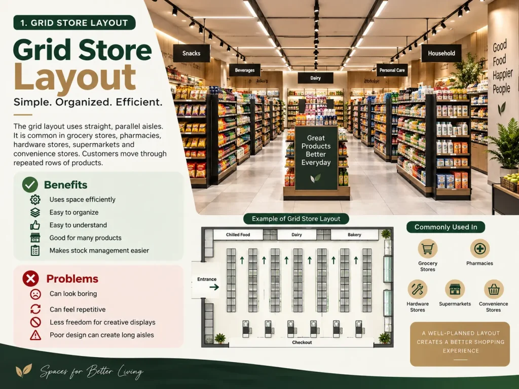
Benefits
- Uses space efficiently
- Easy to organize
- Easy to understand
- Good for many products
- Makes stock management easier
Problems
- Can look boring
- Can feel repetitive
- Less freedom for creative displays
- Poor design can create long aisles
TruRating identifies the grid layout as useful for grocery, pharmacy and large retail stores because it provides efficient space use and easy navigation.
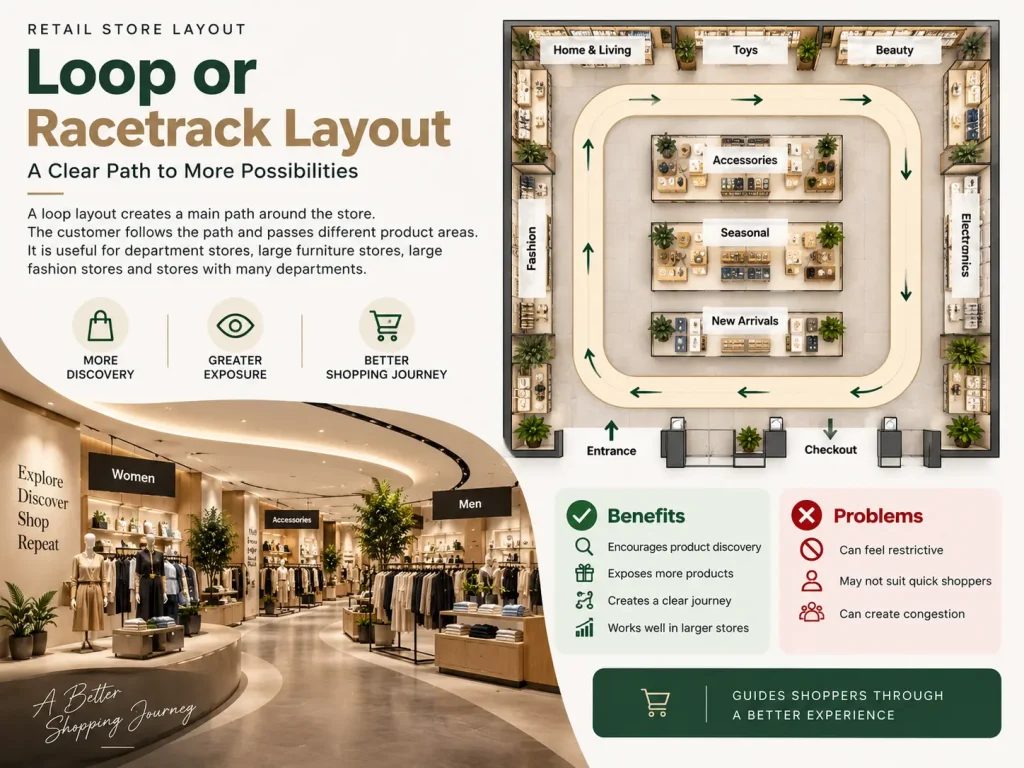
2. Loop or Racetrack Layout
A loop layout creates a main path around the store.
The customer follows the path and passes different product areas.
It is useful for:
- Department stores
- Large furniture stores
- Large fashion stores
- Stores with many departments
Benefits
- Encourages product discovery
- Exposes more products
- Creates a clear journey
- Works well in larger stores
Problems
- Can feel restrictive
- May not suit quick shoppers
- Can create congestion
Smartsheet describes the loop layout as a path that guides customers from the entrance through the store toward checkout.
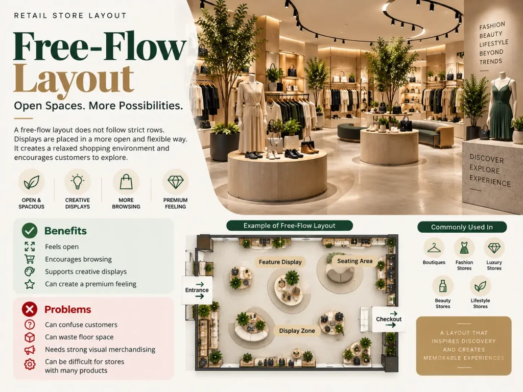
3. Free-Flow Layout
A free-flow layout does not follow strict rows.
Displays are placed in a more open and flexible way.
It is common in:
- Boutiques
- Fashion stores
- Luxury stores
- Beauty stores
- Lifestyle stores
Benefits
- Feels open
- Encourages browsing
- Supports creative displays
- Can create a premium feeling
Problems
- Can confuse customers
- Can waste floor space
- Needs strong visual merchandising
- Can be difficult for stores with many products
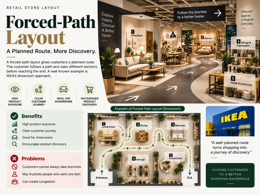
4. Forced-Path Layout
A forced-path layout gives customers a planned route.
The customer follows a path and sees different sections before reaching the end.
A well-known example discussed by Smartsheet and PPMS is IKEA’s showroom approach.
Benefits
- High product exposure
- Clear customer journey
- Good for showrooms
- Encourages product discovery
Problems
- Customers cannot always take shortcuts
- May frustrate people who want one item
- Can create congestion
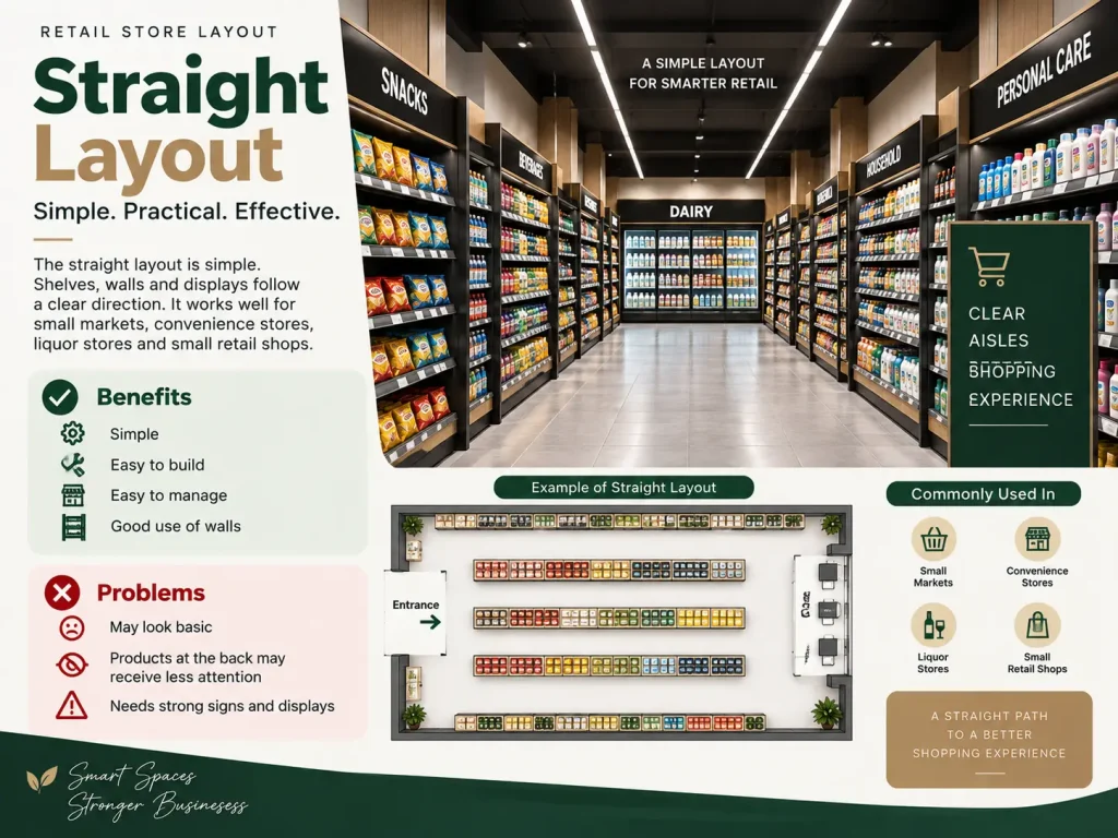
5. Straight Layout
The straight layout is simple.
Shelves, walls and displays follow a clear direction.
It works well for:
- Small markets
- Convenience stores
- Liquor stores
- Small retail shops
Benefits
- Simple
- Easy to build
- Easy to manage
- Good use of walls
Problems
- May look basic
- Products at the back may receive less attention
- Needs strong signs and displays
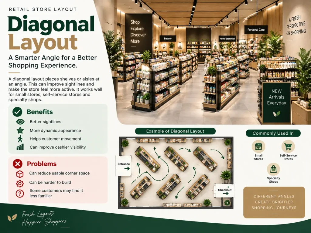
6. Diagonal Layout
A diagonal layout places shelves or aisles at an angle.
This can improve sightlines and make the store feel more active.
It can work well in:
- Small stores
- Self-service stores
- Specialty shops
Benefits
- Better sightlines
- More dynamic appearance
- Helps customer movement
- Can improve cashier visibility
Problems
- Can reduce usable corner space
- Can be harder to build
- Some customers may find it less familiar
7. Angular Layout
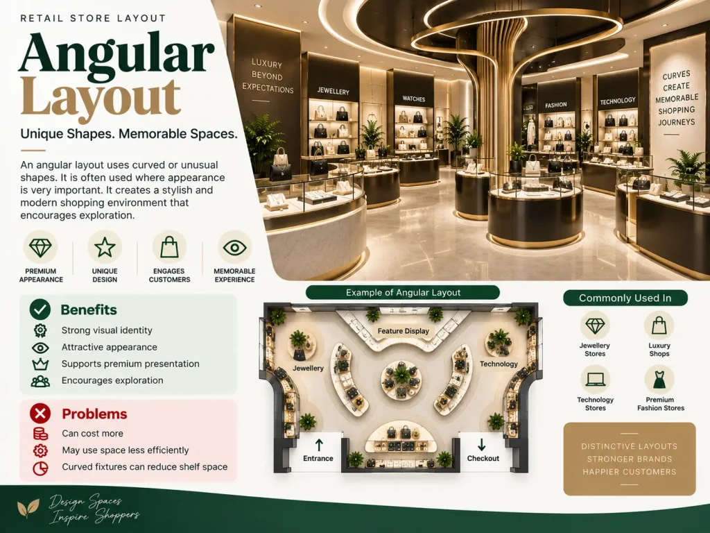
An angular layout uses curved or unusual shapes.
It is often used where appearance is very important.
Examples include:
- Jewellery stores
- Luxury shops
- Technology stores
- Premium fashion stores
Benefits
- Strong visual identity
- Attractive appearance
- Supports premium presentation
- Encourages exploration
Problems
- Can cost more
- May use space less efficiently
- Curved fixtures can reduce shelf space
8. Geometric Layout
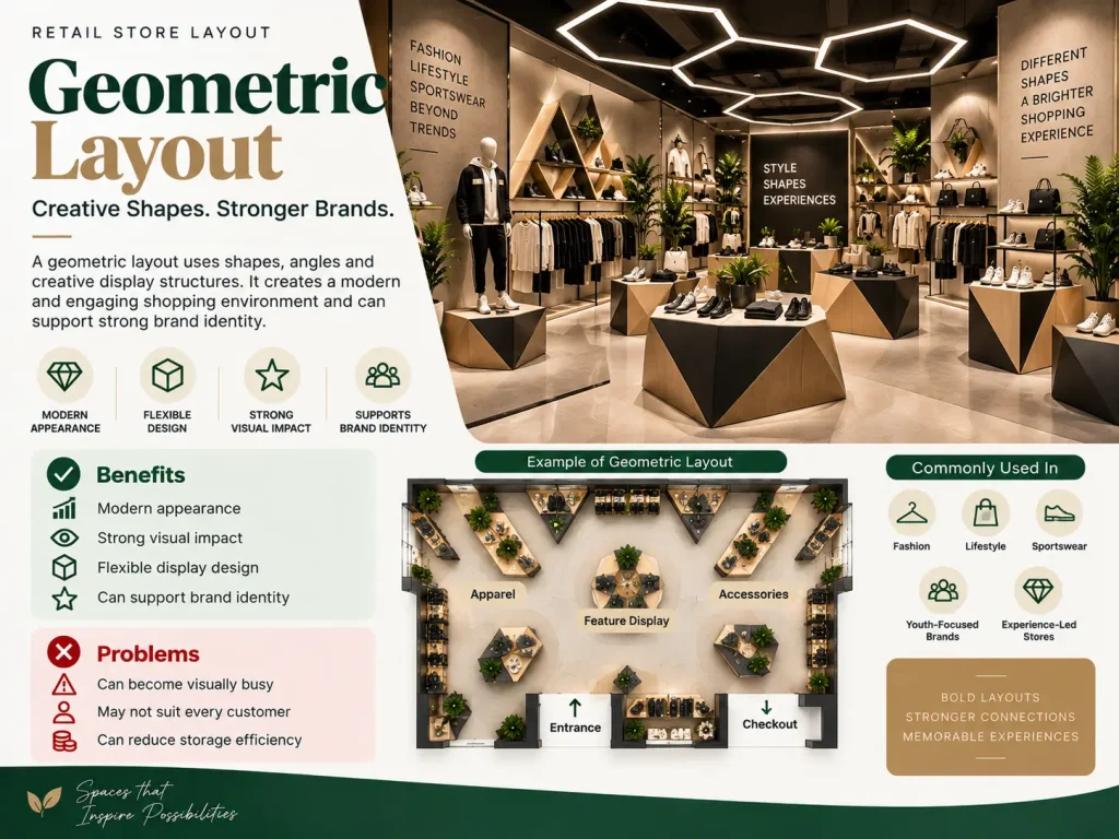
A geometric layout uses shapes, angles and creative display structures.
It can be useful for:
- Fashion
- Lifestyle
- Sportswear
- Youth-focused brands
- Experience-led stores
Benefits
- Modern appearance
- Strong visual impact
- Flexible display design
- Can support brand identity
Problems
- Can become visually busy
- May not suit every customer
- Can reduce storage efficiency
9. Herringbone Layout
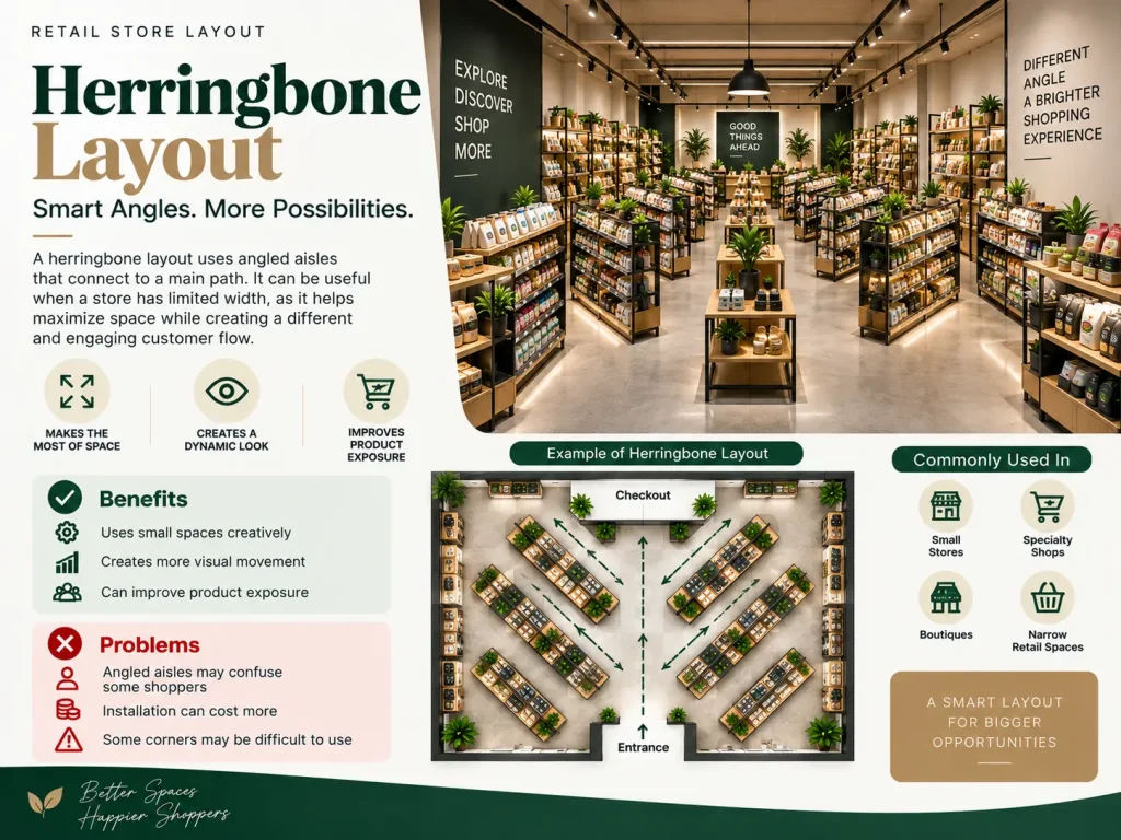
A herringbone layout uses angled aisles that connect to a main path.
It can be useful when a store has limited width.
Benefits
- Uses small spaces creatively
- Creates more visual movement
- Can improve product exposure
Problems
- Angled aisles may confuse some shoppers
- Installation can cost more
- Some corners may be difficult to use
TruRating includes herringbone as a separate retail layout and notes its use for maximizing space while creating a different customer flow.
10. Spine Layout
A spine layout has one main path running through the store.
Smaller sections connect to this central route.
It can work well for larger stores.
Benefits
- Easy to navigate
- Clear main route
- Good for different departments
- Helps organize traffic
Problems
- Main path can become crowded
- Can feel predictable
- Needs good department signs
11. Boutique or Shop-in-Shop Layout
A boutique layout divides one store into smaller shopping areas.
Each area can have its own product story.
For example, a fashion store could have separate spaces for:
- Formal wear
- Casual wear
- Shoes
- Accessories
- New arrivals
This layout can create a more personal shopping experience.
However, too many separate sections can reduce visibility and make the store feel crowded.
12. Mixed Layout
A mixed layout combines two or more layout styles.
For example:
Grid + Free Flow + Boutique
A department store could use a grid for everyday products and free-flow displays for premium products.
Benefits
- Flexible
- Suitable for different departments
- Supports different shopping missions
- Allows creative areas
Problems
- More difficult to manage
- Can become inconsistent
- May cost more
- Needs careful planning
PPMS and TruRating both describe mixed layouts as flexible but more complex to manage.
Retail Store Layout Types Comparison
| Layout | Best For | Main Benefit | Main Risk |
|---|---|---|---|
| Grid | Grocery, pharmacy | Efficient space use | Repetitive |
| Loop | Large stores | High product exposure | Can feel restrictive |
| Free-flow | Boutiques | Exploration | Confusion |
| Forced-path | Showrooms | Full product exposure | Limited shortcuts |
| Straight | Small shops | Simple planning | Less visual impact |
| Diagonal | Small/self-service stores | Better sightlines | Complex corners |
| Angular | Luxury stores | Premium appearance | Lower space efficiency |
| Geometric | Fashion/lifestyle | Strong visual impact | Can feel busy |
| Herringbone | Smaller stores | Uses space creatively | Angled movement |
| Spine | Large stores | Clear navigation | Main path congestion |
| Boutique | Premium categories | Curated experience | Less open space |
| Mixed | Department stores | Flexible | More complex |
Step 6: Plan the Customer Path
Draw the path customers should take.
Think about:
Entrance → Main display → Product categories → Complementary products → Checkout
Do not create paths that are too narrow.
Avoid:
- Blocked aisles
- Sudden dead ends
- Confusing corners
- Too many signs
- Display units blocking products
- Long queues blocking products
Smartsheet’s review of customer-flow research emphasizes avoiding narrow aisles and bottlenecks because they can interfere with comfortable shopping.
Step 7: Place Important Products Carefully
Not every product needs the same amount of space.
Give more attention to products that are:
- New
- Seasonal
- High margin
- On promotion
- Popular
- Important for the brand
- Good for cross-selling
Use:
- Feature tables
- End caps
- Wall displays
- Eye-level shelves
- Window displays
- Promotional signs
But do not fill every high-visibility area with promotions.
Too many messages can make the store difficult to understand.
Step 8: Use the Eye-Level Principle Carefully
Customers can notice products at different heights.
Eye-level shelves can be useful for important products, but product position should depend on the category and customer.
Think about:
- Adult shoppers
- Children
- Elderly customers
- Accessibility
- Product size
- Product weight
- Safety
A store should not simply put every expensive item at eye level.
Instead, use visibility + relevance + accessibility.
Step 9: Design Product Zones
Place products that naturally belong together.
For example:
Coffee → Cups → Sugar → Biscuits
Or:
Laptop → Mouse → Keyboard → Laptop Bag
Or:
Shirt → Trousers → Belt → Shoes
This can make shopping easier and support cross-selling.
Pazo highlights category adjacency as an important part of layout planning: related products can be placed close together when that matches how customers shop.
Step 10: Design the Checkout Area
The checkout is not only a payment point.
It is also part of the customer experience.
Think about:
- Queue length
- Counter position
- POS equipment
- Payment methods
- Bagging area
- Returns
- Customer service
- Impulse products
- Accessibility
- Staff movement
Small products can be placed near the checkout when they are useful and relevant.
Examples:
- Batteries
- Small accessories
- Gift cards
- Travel-size products
- Small add-ons
Do not make the checkout area so crowded that customers cannot move.
PPMS also identifies checkout as an opportunity for relevant upselling and describes different checkout formats such as lanes, counters and self-service kiosks.
Step 11: Use Visual Merchandising With Your Layout
Store layout and visual merchandising should work together.
They are not exactly the same.
Layout = Where things go.
Visual merchandising = How things look and communicate.
Visual merchandising includes:
- Lighting
- Product grouping
- Signs
- Colours
- Props
- Display height
- Product facings
- Window displays
- Promotional messages
- Feature displays
Pazo’s framework connects layout, product priority, presentation and execution instead of treating visual merchandising as something added after the floor plan is complete.
Step 12: Create a Strong Entrance
Your entrance creates the first physical impression.
A good entrance should show:
- What type of store it is
- What products it sells
- Current offers
- New products
- Brand style
But avoid putting too much information at the doorway.
Give customers enough open space to enter and understand the environment.
Step 13: Use the Back of the Store Correctly
The back of the store can become a dead area if customers have no reason to go there.
You can place:
- Destination products
- Popular categories
- Essential products
- Services
- Special displays
But do not hide important products only at the back.
Use signs and visual clues to help customers find them.
Step 14: Use Walls and Vertical Space
Do not think only about floor space.
Use:
- Wall shelves
- Tall displays
- Hanging signs
- Digital screens
- Vertical product displays
- Brand graphics
Vertical space can increase display capacity without filling the walking path.
However, products should remain reachable and visible.
Step 15: Think About Staff Movement
Customers are not the only people using the store.
Employees need to:
- Refill shelves
- Move stock
- Help customers
- Clean
- Manage checkout
- Receive deliveries
- Handle returns
A beautiful customer path can fail if staff constantly cross it with boxes.
Design separate or controlled stock routes where possible.
Step 16: Design for Safety and Accessibility
A retail layout should be safe for everyone.
Check:
- Emergency exits
- Fire safety
- Clear walkways
- Stable fixtures
- Safe shelves
- Electrical cables
- Wet-floor areas
- Wheelchair movement
- Stroller movement
- Seating where needed
- Accessible checkout options
Always follow the building, fire, accessibility and safety rules that apply in your location.
Retail Store Space Planning Table
| Store Area | Main Purpose | Layout Tip |
|---|---|---|
| Entrance | First impression | Keep open |
| Decompression zone | Customer adjustment | Avoid clutter |
| Main floor | Product discovery | Create clear paths |
| Feature zone | Promote key products | Use strong visual focus |
| Category zones | Easy shopping | Group related products |
| Back area | Destination products | Use signs |
| Checkout | Payment | Keep queue organized |
| Customer service | Support | Make it easy to find |
| Storage | Stock | Keep staff movement practical |
| Exit | Customer departure | Avoid obstruction |
How Much Space Should You Give Each Product Category?
Do not divide space equally just because it looks neat.
Use sales and customer data.
For example:
A category that generates high sales may need more space.
A category with low sales but strong strategic value may need a smaller but more visible display.
Consider:
- Sales
- Profit
- Product size
- Stock levels
- Demand
- Season
- Customer interest
- Cross-selling value
The exact space percentage should be decided using your own store data rather than a fixed rule.
How to Design a Small Retail Store Layout
Small stores need careful space planning.
For a small store:
- Keep the entrance open.
- Avoid oversized fixtures.
- Use wall space.
- Keep paths clear.
- Use flexible displays.
- Group related products.
- Use strong signs.
- Avoid too many product categories.
- Use the checkout area carefully.
- Test the layout regularly.
A free-flow or diagonal approach may work well for some small stores because it can improve sightlines and create a more open feeling, but the final choice should depend on the products and customer mission. PPMS specifically discusses diagonal and free-flow options for small stores.
How to Design a Medium Retail Store Layout
Medium stores have more space but can still develop dead zones.
Use:
- Clear departments
- Main customer paths
- Feature areas
- Category signs
- End displays
- Flexible fixtures
- Checkout zone
- Stock routes
Create a simple map that a first-time customer can understand.
How to Design a Large Retail Store Layout
Large stores need stronger navigation.
Use:
- Main paths
- Department signs
- Colour coding
- Category signs
- Wayfinding
- Destination zones
- Rest areas where appropriate
- Multiple checkout points if needed
- Customer-flow measurement
A loop, spine or mixed layout may be considered depending on the store type.
The goal is not to make customers walk the maximum distance.
The goal is to make the journey useful and easy.
Retail Store Layout and Customer Flow
Customer flow means how shoppers move through your store.
You can study:
- Where customers enter
- Where they turn
- Where they stop
- Where they spend time
- Which aisles they skip
- Which displays they notice
- Where queues form
- Which areas are crowded
- Which areas are empty
A floor plan shows the planned movement.
Customer data shows the real movement.
That difference is very important. Pazo specifically points out that a floor plan does not prove how customers actually move and recommends looking for high-traffic zones, dead zones, bottlenecks, queues and areas customers bypass.
How to Measure Retail Store Layout Performance
Do not judge a layout only by appearance.
Measure it.
| Metric | What It Tells You | Example Question |
|---|---|---|
| Foot traffic | Number of visitors | How many people enter? |
| Dwell time | Time in an area | Where do people spend time? |
| Conversion rate | Visitors who buy | Are visitors becoming buyers? |
| Average basket value | Average purchase value | Are customers buying more? |
| Category sales | Product performance | Which areas sell more? |
| Dead zones | Low-use areas | Which spaces are ignored? |
| Queue time | Checkout experience | Are customers waiting too long? |
| Heat map | Movement pattern | Where do people walk? |
| Planogram compliance | Display accuracy | Is the intended display maintained? |
| Repeat visits | Customer behaviour | Does the store encourage return visits? |
PPMS recommends heat maps, dwell-time analysis and planogram compliance as ways to measure layout performance.
What Is a Retail Heat Map?
A retail heat map shows where customers move or spend time.
It can help identify:
- Hot zones
- Cold zones
- Busy aisles
- Dead areas
- Product interaction areas
- Bottlenecks
For example:
If a new-product display gets many views but very few sales, the problem may not be the layout.
It could be:
- Price
- Product information
- Product quality
- Offer
- Stock
- Display message
This is why layout data should be combined with sales data.
Layout Problem or Merchandising Problem?
This is an important question.
If customers cannot find the category, the layout or navigation may be the problem.
If customers find the category but do not notice the products, visual merchandising may be the problem.
If customers notice the products but do not buy, the issue may be price, product, offer, availability or sales support.
Pazo makes a similar distinction between layout problems and execution problems, noting that redesigning the whole store may be unnecessary when the actual problem is product placement or poor execution.
Planogram vs Store Layout
These terms are related but different.
Store layout: Shows where departments, aisles, fixtures and customer paths are located.
Planogram: Shows how products should be arranged on a particular shelf, display or fixture.
Example:
The store layout says:
Shampoo section → Aisle 4
The planogram says:
Brand A → 3 facings → Brand B → 4 facings → Brand C → 2 facings
Both should work together.
How Group DCA Can Approach Retail Store Layout Design
A professional retail design process should connect the business goal with customer behaviour and physical space. Group DCA can approach a retail store project by first understanding the brand, customer, products and available space, then developing zoning, circulation, fixtures, lighting, visual merchandising and customer touchpoints as one connected system.
The important goal is not simply to make the store look attractive. It is to make the space easy to use, easy to manage and aligned with the brand.
Future of Retail Store Layout Design
Retail store design is becoming more data-driven and flexible.
Future layouts can use:
- 3D design
- AI-assisted planning
- Digital twins
- Customer heat maps
- Smart cameras
- IoT sensors
- RFID
- Digital signage
- Self-checkout
- Mobile shopping
- Electronic shelf labels
- Real-time inventory data
- Augmented reality
- Virtual reality
- Customer behaviour analytics
The future store may not have one fixed layout for the entire year.
Instead, stores can test different layouts and change displays based on:
- Sales
- Season
- Customer traffic
- New products
- Events
- Local demand
- Customer feedback
Smartsheet discusses heat maps, sensors, RFID, digital experiences and data as technologies that can support retail design and customer-flow decisions.
What Tools Can You Use to Design a Retail Store Layout?
You can use different tools depending on your skill level and project size.
1. AutoCAD
Useful for professional 2D floor plans and technical drawings.
2. SketchUp
Useful for 3D store models, fixtures and visual presentations.
3. Floorplanner
Useful for creating floor plans without advanced CAD skills.
4. SmartDraw
Useful for quick floor plans, diagrams and planning.
5. Foyr Neo
Useful for interior and retail space visualization.
6. Planner 5D
Useful for simple 2D and 3D space planning.
7. Excel or Google Sheets
Useful for recording:
- Product categories
- Sales
- SKU counts
- Space allocation
- Fixture counts
- Category performance
8. Heat Map and Retail Analytics Tools
Useful for understanding real customer movement after the store opens.
9. Planogram Software
Useful for deciding exactly how products should be arranged on shelves and displays.
The best workflow is often:
Measure → Draw → Build 3D Model → Add Products → Test Flow → Open Store → Collect Data → Improve
How AI Can Help Design Retail Stores in the Future
AI can support retail planning by helping teams compare different layout ideas.
For example, an AI system could use:
- Store dimensions
- Product dimensions
- Sales data
- Customer movement
- Product categories
- Stock data
- Customer profiles
- Checkout data
It could then help create different layout options for testing.
AI should support the designer rather than replace real-world testing.
A layout may look excellent on a computer but create problems when customers, staff, stock carts and queues use the real space.
How to Test a New Retail Store Layout
Before making a final layout, test it.
Test 1: Customer Walk
Walk through the store as a first-time customer.
Ask:
- Can I find the entrance?
- Can I see where to go?
- Can I find the main category?
- Are signs easy to understand?
- Are aisles comfortable?
- Can I reach checkout easily?
Test 2: Staff Walk
Ask an employee to restock products.
Check:
- Can they reach shelves easily?
- Do stock movements block customers?
- Is storage close enough?
- Are boxes creating obstacles?
Test 3: Busy-Time Test
Imagine the store is full.
Ask:
- Where will customers queue?
- Can two people pass?
- Can customers stop at displays?
- Can staff help people?
- Can customers reach checkout?
Test 4: Accessibility Test
Check whether different customers can move through the store comfortably.
Common Retail Store Layout Mistakes
Avoid these mistakes:
1. Too Much Product at the Entrance
The entrance becomes confusing.
2. Narrow Aisles
Customers may feel uncomfortable.
3. No Clear Navigation
People cannot find categories.
4. Too Many Signs
Customers stop understanding which message matters.
5. Poor Checkout Placement
Queues block the shopping area.
6. Ignoring Staff Movement
Employees struggle to refill products.
7. Copying a Competitor
Another store’s layout may not fit your customers.
8. Ignoring Sales Data
A pretty display does not automatically mean better sales.
9. No Flexible Fixtures
The store becomes difficult to change.
10. No Testing
Problems remain hidden until customers experience them.
How to Make a Retail Store Layout More Flexible
Retail products change.
Seasons change.
Customer behaviour changes.
Therefore, the layout should also be able to change.
Use:
- Movable shelves
- Modular fixtures
- Adjustable shelving
- Mobile tables
- Flexible signage
- Removable displays
- Digital signs
- Adjustable lighting
- Reconfigurable zones
TruRating notes that flexible layouts make it easier to respond to new products, customer feedback, seasonal promotions and changing shopping behaviour.
Retail Store Layout Design Checklist
Before opening your store, check the following:
| Area | Check |
|---|---|
| Entrance | Is it clear? |
| Decompression zone | Is it free from clutter? |
| Aisles | Can customers move comfortably? |
| Products | Are important products visible? |
| Categories | Are related products grouped? |
| Signs | Are they easy to understand? |
| Lighting | Are products clearly visible? |
| Checkout | Is the queue controlled? |
| Staff | Can employees restock easily? |
| Storage | Is stock accessible? |
| Safety | Are exits and paths clear? |
| Accessibility | Can different customers move comfortably? |
| Displays | Can they be changed? |
| Data | Can layout performance be measured? |
A Simple Retail Store Layout Process
If you are starting from zero, use this process:
1. Measure the store
↓
2. Understand your customers
↓
3. List all product categories
↓
4. Study sales and product data
↓
5. Divide the store into zones
↓
6. Select a suitable layout
↓
7. Draw customer paths
↓
8. Place fixtures
↓
9. Place products
↓
10. Add signs and visual merchandising
↓
11. Design checkout
↓
12. Check safety and accessibility
↓
13. Test customer and staff movement
↓
14. Open the store
↓
15. Measure customer behaviour
↓
16. Improve the layout
This creates a continuous improvement process rather than treating store design as a one-time project.
How Group DCA Can Build a More Customer-Focused Retail Space
Group DCA can use a customer-first design approach where the layout, product zones, display strategy, lighting, circulation and brand experience are planned together.
The process should begin with questions such as:
- Who is the customer?
- What does the customer want?
- Which products are most important?
- Which products belong together?
- Where do customers need help?
- Where should customers slow down?
- Where should they move quickly?
- Which areas need more visibility?
- Where will staff work?
- How can the layout change later?
This makes the store more than a room filled with products. It creates a clear shopping journey.
Retail Store Layout: Final Takeaway
The best retail store layout is not simply the layout that looks the most beautiful. It is the one that makes sense for the customer, products, store size, staff, brand and business goals.
Start with customer behaviour. Measure the space. Create useful zones. Choose the right layout. Keep paths clear. Place products carefully. Connect visual merchandising with the floor plan. Design the checkout properly. Then use real customer and sales data to improve the store.
Modern retail design is moving toward flexible, measurable and technology-supported spaces. A strong layout should therefore work today while being easy to change tomorrow.
For a professional retail environment, Group DCA can use this complete process to connect spatial planning with customer experience, visual merchandising and brand identity.
Frequently Asked Questions About Retail Store Layout
1. How do you design a retail store layout?
Start by measuring the store and understanding your customers and products. Then divide the space into zones, choose a suitable layout, create customer paths, place fixtures and products, design the checkout, and add signs and lighting. Finally, test the layout and use sales and customer-flow data to improve it.
2. What is the best retail store layout?
There is no single best layout for every store. A grocery store may need a grid layout, while a boutique may use free-flow or boutique planning. A large showroom may use a loop or forced-path layout. The right choice depends on store size, products, customers, shopping mission, staff movement and business goals.
3. What are the main types of retail store layouts?
Common types include grid, loop, free-flow, forced-path, straight, diagonal, angular, geometric, herringbone, spine, boutique and mixed layouts. Each has different strengths. Some focus on efficient space use, while others focus on browsing, product discovery, visual impact or customer guidance. The layout should match the store and the way customers shop.
4. How do you design a small retail store layout?
Use the available space carefully. Keep the entrance open, use walls and vertical areas, avoid large fixtures, create clear paths, group related products and use flexible displays. A small store should not feel crowded. Diagonal and free-flow layouts can work in some small stores, but the product range and customer journey should guide the final decision.
5. What should be placed near a retail store entrance?
Keep the first area simple and easy to understand. You can place strong visual messages, new products or selected promotions after the initial entrance area. Avoid filling the doorway with too many products or signs. Customers need a short space to enter, adjust to the store and understand where they should go.
6. What is a decompression zone in retail?
A decompression zone is the area just inside a store entrance where customers adjust to the new environment. They may be looking around, understanding the store and changing from outdoor movement to shopping. Keeping this area open can make the entrance easier to understand and reduce visual clutter.
7. How can store layout increase sales?
A good layout can make products easier to find and notice. It can also support product discovery, cross-selling, impulse purchases and smooth movement. However, layout alone does not guarantee higher sales. Product price, quality, stock, offers, staff service and customer demand also affect sales. Measure results before deciding whether a layout works.
8. What is the difference between store layout and visual merchandising?
Store layout decides where departments, aisles, fixtures and paths are placed. Visual merchandising decides how products and displays are presented. For example, the layout may place shoes beside clothing, while visual merchandising decides the lighting, product grouping, signs and display style used in that area.
9. How wide should retail aisles be?
There is no single width that works for every store. Aisle width depends on store type, fixture size, customer volume, accessibility needs, shopping carts and local rules. The important goal is to provide safe and comfortable movement. Check applicable building, fire and accessibility requirements before final construction.
10. How do heat maps help retail store design?
Heat maps show where customers move or spend time. They can identify busy areas, quiet areas, bottlenecks and places customers avoid. This information can help retailers change product displays, paths or zones. Heat maps are more useful when combined with sales, conversion and dwell-time data rather than used alone.
11. What is a planogram in retail?
A planogram is a visual guide that shows how products should be placed on a shelf, display or fixture. It can show product order, facings, shelf positions and display space. A planogram is more detailed than a general store floor plan. It helps store teams keep product presentation consistent.
12. What is a grid layout in retail?
A grid layout uses straight, usually parallel aisles and repeated product rows. It is common in supermarkets, pharmacies and hardware stores. It makes product finding and stock management easier and uses floor space efficiently. Its main weakness is that it can feel repetitive unless signs, displays and product presentation add visual interest.
13. What is a free-flow retail layout?
A free-flow layout gives customers more freedom to move around the store. It does not depend on long, straight aisles. It is common in boutiques, fashion stores and premium retail spaces. It can encourage browsing and create an open feeling, but it needs strong signs and visual cues so customers do not become confused.
14. What is a loop or racetrack layout?
A loop layout creates a planned path around the store. Customers move through different areas before reaching the checkout. It can increase product exposure and works well in large stores with many departments. However, customers who want one specific product may find a long route inconvenient. Clear shortcuts can help reduce this problem.
15. What tools can be used to design a retail store layout?
Common tools include AutoCAD, SketchUp, Floorplanner, SmartDraw, Foyr Neo and Planner 5D. Spreadsheet tools can also help organize product and sales information. Professional stores may use planogram and retail analytics software. The best tool depends on the project’s size, required detail, budget and whether you need 2D drawings or 3D models.
16. How can AI help with retail store design?
AI can help compare layout ideas using information such as store size, product data, customer movement and sales. It may help identify crowded areas or unused space and suggest different planning options. However, AI output should still be checked by designers and store teams because real customer movement and operational needs can differ from computer models.
17. How often should a retail store layout be changed?
There is no fixed schedule. Review the layout when customer behaviour, product ranges, seasons, sales patterns or business goals change. Small display changes may happen regularly, while a full floor-plan change may happen much less often. Use customer feedback and sales data to decide whether a change is actually needed.
18. How can you improve a poor retail store layout?
First identify the real problem. Look for crowded paths, dead zones, poor product visibility, confusing signs, long queues and difficult staff movement. Then make one change at a time where possible and measure the result. Do not rebuild the whole store if the actual problem can be solved through better product placement or merchandising.
19. What makes a retail store layout customer-friendly?
A customer-friendly layout is easy to understand, comfortable to move through and simple to navigate. Customers should be able to find important categories, see useful signs, access products and reach checkout without unnecessary obstacles. It should also support different customer needs, including accessibility, comfort and different shopping speeds.
20. What will retail store layouts look like in the future?
Future stores are likely to use more flexible fixtures, digital displays, customer-flow data, sensors, RFID, AI-assisted planning and real-time inventory information. Stores may test layouts and change displays based on customer behaviour instead of keeping one fixed arrangement. The main focus will remain the same: make shopping easier while using store space effectively.