Best Hospitality Projects in India by Group DCA

Group DCA is a product of a partnership spread over 20 years of two ambitious and multi-talented architects Amit Aurora and Rahul Bansal. Graduating in 1993 from the esteemed School of Planning and Architecture (SPA), New Delhi, they are visionaries adept in the field of architecture and interior design. groupDCA is one of the top hospitality design firm which was founded in 1996, over the years it has acquired national and international acclaim for it’s out of the box, contemporary design methods. They redefine spatial structure by enhancing aesthetics keeping in mind the client’s sensitivities and cost effectiveness. Their functioning is in sync with the “make in India” ideology, hence there is a conscious use local, Indian – sustainable materials/technology, along with minimizing the impact on the environment. The firm has self aggrandized in the field of design architecture through its accomplished projects. The firm is involved and has achieved success in a variety of projects such as commercial spaces and complexes, residential, salons and spaces, luxury retail outlets and restaurants.

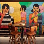
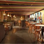
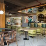
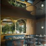
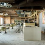
Group DCA have portrayed their ingenuity and originality in architectural and interior design in the hospitality sector. The restaurant projects undertaken by Group DCA have carved a niche in terms of modern, minimalism. One of them is the very popular Amour Bistro situated in the Diplomatic hub of Delhi, Malcha Marg. The restaurant draws its inspiration from an enchanting European bistro and is infused with a Mediterranean feel, not only in its décor but also its food. The design is such that one feels he is sitting in a cocoon of Mediterranean ambience amidst the hustle and bustle chaos of  a chaotic city. The design enhances the dining experience.

Amour Bistro has been designed magnificently yet the earthy tones, rustic touches and minimal elements speak volumes about its simplicity.  It is elegant and exudes luxury , its warmth and familiarity is inviting to anyone who dines here . Certain design elements that have been so artfully put together to accentuate the above. Low wooden slatted ceiling with textured plaster white wall on one side and full length glass windows on the other allows passers-by to catch a glimpse of the interiors.  A trio of musician statues above the kitchen counter and a wine rack on the double height wall are two installations that catch the eye of the visitors.

The Euro-Mediterranean essence is further brought to life through the furniture made of fine materials with rustic colour finishes. They are subtlety offset by a brick backdrop, painted in white. The dining space has black painted metal dining chairs interspersed with some sand blasted custom-made seating and bespoke wall lights. The chandeliers are made in wrought iron. All elements have been woven together to give you a bistro of fine dining with the feel of luxe and warmth.


Town Hall, situated in the middle of the central wing of Khan Market in New Delhi is another famed project by Group DCA. Being one of the best hospitality design in the city, having won some highly celebrated architecture award. The location and the shell of the building which is distinctly colonial are the keys factors in the construction of its theme. The firm, truly adhered to the roots of the building and designed the restaurant in a post-colonial and post – independence theme. The furniture, the patterns and textures adopted are very classical and provide an authentic flavour to the space keeping alive the old-world Charm of the 50s.

Another quintessentially charming place that has come to life by the firm is “Backyard”, situated amid the buzzing and busy streets of Green Park, New Delhi. As the name suggests it a little place where one can enjoy a ‘time out’ from the busy streets and feel relaxed and happy. The architecture & interior design approach here went beyond the mainstream and the emphasis was on creative utilization of materials are obsolete or thrown away in one’s backyard. This out of the box design approach gave the café a distinct identity of its own.

The brilliantly creative team of Group DCA has put in individuality, character and uniqueness in each of their projects through their artistically thought over designs themes. Whether it’s an experience of sitting in a European bistro, or enjoying a dining experience in the post-independence era. Whether the ambience is colonial or it amounts to experiencing a much-deserved timeout in place which would feel like your own backyard, each is beautifully and effortlessly designed to impart a feeling of relaxation and ease.

Group DCA has simply put life into the inanimate.


Reinventing Design and Architecture

Over the years, ‘space’ as an expression has acquired multiple meanings and has evolved in terms of its perception and design. Spaces may need to be dramatic & emphatic, warm & calming, straight & functional, or minimalistic & simple. Different users derive different usage out of a space. In a day and age where large spaces are either very few or very expensive, the importance of  ‘relevant design’ and ‘value-engineering’ has become paramount.

While macro spaces are perceived as a combination of the larger ambience, spaces surrounding it and its use by masses, micro spaces witness a more personalized and customized design approach. In today’s era of specialization, modularity and flexibility, spatial designing and multi-functionality have become a common and detailed phenomenon.

Design and Articulation of pre-existing small spaces is recommended in a manner that it creates a fresh definitive space, yet also maintains a relation to the previous meaning / experience lent by the space. The driving factors to instill the same comes from a variety of elements that can be used to ornament a space. Factors such as highlights, contrasts, harmony and balance could be inculcated through the conscious choice of material, lighting, color palette etc.

After having executed various design projects across India, one of India’s top architecture firm, groupDCA thinks, small spaces also need to be versatile in order to compensate for its limitations in structural changes and volume. Multifunctional items like modular tables, which combine together as conference tables and/or storage in offices, sitting that couples up as storage, or kitchen work-tops that are adaptable as dining spaces in homes – increase the efficiency of a space. Use of elements like glass, mirrors and green plants lend a spacious & positive feel.

A simple office corner cubicle with elements like ambient lighting, glass partitions, a neutral color palette and a touch of green could do the trick.  Greenery could be infused in the design from even a small potted plant, but it will permeate to give a completely different experience as compared to a cubicle left bland, dull and mono-functional. Additionally, incorporating art (as per the likes of the user) gives a warm-personal feel to the space. Detailing of elements in a small space design has the capability to impact a user to a great extent.

To sum up, the productivity of a space can be judged from the satisfaction its user derives from it and a designer is called proficient if he/she is able to ensure the same.

Luxury Retail Stores – DCA

The contemporary design comprehension of a brand or its entity is identity oriented. Accordingly, brands along with their designated spaces are visualized by the consumer, making them a part of a holistic experience, captivating their hearts.

In the domain of watches, groupDCA has carved a niche for itself by executing some magnificent projects across India. Being one of the best retail design firm in Delhi,

The successive characteristics of luxury products therefore correlate largely with the store design. As a result, in an efficient store, the emphasis of the user on the products will be enhanced with architecture filling-in as an aid.

One such example Johnson Watch & Company built on an area of 1200 sq. ft,

The prime thought was to give a contemporary design finish with basic, distinguished palette of materials, meticulously placed in a manner to allow the watches to act as an adornment leaving the consumers spell bound.

Basic materials and a warm, light palette exhibit the retailer’s sensibility. Contrasting display stone boundaries were used to emphasize on the inter relation between the zones. Central master piece of light has been placed to break the consistency of the symmetrical flooring and ceiling pattern. Fine gold metallic Jali pattern at the elevation of the display counter with each Watch enclosed in a glass box and graciously displayed portrays the grandness of the brand.

The Kapoor watch & Company built in the year 2009 draws the users by its brand versatility exhibited in a breathtaking fashion. Placed in the heart of aristocracy (DLF EMPORIO), it is a rapturous luxury of the exquisite guests.

Group DCA has delineates and executed the design for this store with heterogeneous brand range.

The main focus was to design the store in a way that provides great visibility to all the brands showcased in the store.

On an area of 53.64 sq. m., the watch gallery has been regarded as a timeless masterpiece of fine artistry. Great efforts in layout and creativity concerning function, materials, and visuals have made this store simply unique.

A store, being the fundamental inspiration and attraction of a brand entity compliments the products displayed alluring the users. Therefore, the guideline for the interior design is to use aesthetically pleasing color combinations and to develop magnificent structures creating a soft atmosphere, comfortable and elegant setting with sobriety.


Luxury Retail Showrooms by Group DCA

The renowned Gabrielle Coco Chanel said, ‘Luxury is a necessity which starts where necessities end’ (Karra, 2011). True to its essence, Luxury in fact is a necessity that is linked to individuals with a high profile, and as a tool, luxury products are optimised for high visibility and as specific means of communication. Enhancing Desire more than the mere function of meeting the customers’ needs, Luxury products usually convey a compelling story that is well- presented and packaged to breath-taking perfection.

All top Retail Stores, typically, operate only as a window to display products; however, in the recent years, with the ever-increasing onslaught of luxury products in the market and the competition, the experience inside a retail store is as crucial as the brand itself. Focusing on the sensory, far beyond the transactional activities,the most important point to keep in mind while designing top retail design luxury retail store is that it should be Future-ready with a next generation design/layout and create a fashion statement.There is an increased focus on lighting, materials, display systems and the interior decor, and the cost of lighting and sourcing is a vital part of the entire process, therefore being done only through selected vendors. Day and Night Lighting moods and effects are conceived with exclusive design intent with no compromise on the lighting fixtures.

Working with the adage of ‘Outer beauty pleases the eye, whereas the inner beauty captivates the heart’, the layout of the store is crafted experimentally in order to create dynamic forms within the store. For example, instead of the traditional horizontal or vertical seating arrangement, round arrangements have now become very popular. And then to please the eye, the external façade becomes the highlight, symbolically representing the brand. For example, according to the store’s requirements, the entrance areas are now looked at in detail with additions being made to the immediate external environment such as the stairs, the plants and even clutter-free parking areas are designed exclusively. The façades and the display window have of course seen a major transformation in the past few years. Grandeur and Luxury go hand-in-hand, and store owners are guiltlessly ready to spend more on the façade than on the interiors. Materials with an inherent quality of timelessness such as wood and stones such as Italian marbles are tapped as extensively on the façade as in the interiors.

In today’s global markets, where there is a new luxury brand every month, it is critical to stand apart from the crowd. The competition is no longer on just a local stage, but also in the global economy. Therefore, a lot of importance and thought is given to branding and signage with these becoming seasonal design exercises in themselves.

The execution process has changed a lot since the old business holders have handed over the business to the new generations, with a great emphasis on quality and the experience of customers. Even though in India, Cost saving for owners has been a major challenge, it is essential to achieve good design and good quality, all at great value. Technological investment is still upcoming, but the motivation is being acquired.

The luxury retail segment is still evolving in India. Emporio Mall in Delhi has been the game changer, in this one mall the whole of India got a taste of luxury retail concept be it layout, lighting, materials, details , merchandising etc. Group DCA are fortunate to have handled over 20 projects in this mall.

Luxury retail projects lay a lot of importance on shop front and branding. Materials used are usually very warm and merchandising is sparse. Each product is a hero!

After people visit a luxury store more than remembering the interiorsit is the product which is supposed to stay in their mind. Lot of emphasis is laid on making the merchandise look irresistible and comfortable.

On a technical side-quality of execution is sacrosanct. If the quality and detailing in the execution is not upto the mark it reflects on the quality of product being sold. This analogy is simply not accepted by global luxury brands. This is something we learnt  by doing these over 20 projects in emporio.  Today we have mastered this whole act of designing and setting up any luxury format across the country.

In today’s global markets, by simply placing a product in the market with a ‘luxury’ label attached, will not attract the targeted customers; Uniqueness of Store design, the appropriate ambience and experience, Diligent planning, execution and clever strategic marketing are factors that will eventually shape the success of the store.

Architecture Material Selection for Residential Projects

Having completed more than two decades in the Architecture Industry, Amit Aurora and Rahul Bansal, Principal Architects of groupDCA, one of Delhi’s best architecture and interior design firm, feel that ‘Selection of Material’ in today’s context does not get its due attention and scrutiny where as this aspect is of paramount importance and can affect the residents in the long run. The selection should be considered in accordance to the fact that one material blends with the others, the effect it has on the budget, the detailing and sustenance. Selection should also be in accordance to the climatic conditions and surroundings of the area. These parameters refer generally to the exterior spaces, however some considerations like textures, aesthetics along with the look and feel of the space should be considered while selecting material for interiors of a place.

As one of the best residential architecture firm in Delhi, groupDCA has executed some top residential designs in the country using locally produced or sourced material. Using traditional crafts keeps the environmental footprint low and encourages local craftsmanship which is the need of the hour. For example, an architect can use local material favoring the Indian climate even for luxury housing. A set of complementing materials should be utilized. Some architects do not consider this aspect earnestly. The biggest enemy for any architecture project is water and that should be analyzed before selecting a material.

Sometimes, the selection of material is based on inspiration. As to create a larger than life space, rich and elegant materials are used. At times, the subtle usage of materials and textures that blend seamlessly with the overall color palette, lighting of an expanse are given importance. Often we have been a little experimental using Ochre PU panels, and Calcutta White as the stone flooring material for a luxury jewellery store. With the advancement and availability of versatile technology, selecting the material is of paramount importance. This has given us flexibility as materials are being utilized in different ways. Like we used wooden doors and exposed brickwork in ash grey combined with sand blasted reclaimed wood used in the furniture as it is sustainable and added the required eclectic feel to the space.

In a nutshell, one should be conscious and aware in selecting the material for individual spaces.

groupDCA is an award-winning, nationally and internationally acclaimed, multi-disciplinary design firm. Known for its top retail interior designs, the firm is based out of New Delhi, India, providing services in Architecture, Interior designand Design Coordination across a wide range of building types. Founded in 1996, the firm is helmed by Architects Amit Aurora and Rahul Bandal. Over the last two decades, the firm has accomplished some of the best retail and hospitality projectsin India.

Luxurious Salon Designed by DCA in Delhi and NCR

As the salon culture basks in its budding trendiness and reputation, a stylish place to spend the beauty time, creates a more beautiful and relaxed self. With the society constantly moving towards achieving a ‘more luxurious lifestyle’, spending time in salons has become an important recreational activity for both men and women.

To cater to this growing trend, the well-known skin care brand O3+ distinguishes itself by tuning up its professionals in their advanced training centre, called Visage that serves as a learning place for all its staff. Creating a niche in design, DCA Architects has exceptionally crafted this comprehensive learning environment that is learner-centric, functional, aesthetically pleasing and strongly supportive of the brand’s identity.

As one enters into the reception, a tranquil space welcomes the visitors. The skin bar stands opposite to the reception, complemented by a sublime white ceiling over it. The warm lights in the space set the right atmosphere. Stretching out to the right of the skin bar, a full height display exhibits the brand’s tailor made world class cosmetics and skin care products. The wall also boasts the branding logo, displayed in black on a warm backdrop. Howbeit, the space is conducive to learning, yet provides a calm, comfortable and soothing environment that resonated with the brand ethos.

The reception narrows down to a lobby that leads on to the facial rooms and classrooms. The spatial planning is enabled in a manner that helps to give a less claustrophobic feeling to the space.

The classrooms are designed as per a commercial setting. The centre is equipped with high-class technology and lets the training staff gain practical experience, before stepping out into the real arena. The client’s desire for a soothing environment is satisfied by a neutral palette and warm details dotted throughout the space.The false ceiling in wood further accentuates the design, while highlighting the space and lending it a unique identity.

The model facial room that lies adjacent to the meeting room, is a replica of the actual space and showcases how the real space and service should be. The reclining styling, display shelves and frames all feature the clinical finish.The face sink is housed in a podium in the rear. The warmth and charm of the room is enhanced by Use of wood in some places.

The meeting rooms are used for conversations and discussions on how they are going to perform the services in their salons and what they have to work on. Lined up by large windows on one side, used to exploits the neighboring views. The ceiling is a feature in each room and breaks the monotony of the color tone. The grey in the ceiling creates warmth within the white, clean look of the space. The grey mat flooring and the touch of simplistic lighting is soothing and adds calm to the serene environ. The design still adds warmth, character and a comfort zone to the space.

The design for this centre is simple and evokes an aura of peace, calm and relaxation that attempts to create an indulgent space for the learners. This is achieved through design and the materials used in a clinical color and theme that is prevalent for skin care rooms world-wide.