Khanna Jewellers, New Delhi
Category: Retail
Location: New Delhi
Area: 1590 sq ft
Client: Khanna Jewellers
Year: 2018
Customize- & Not Cookie-cutter I Imbibe thought, Intent and Tradition
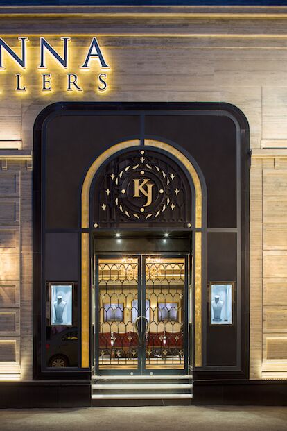
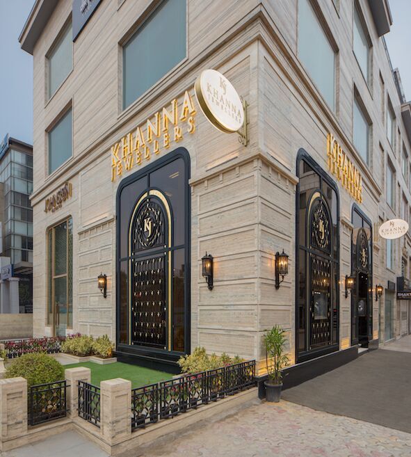
A showroom that justifies the legacy of Khanna Jewellers. Three doorway arches have been placed on the façade, connected to each other using cornices. The black metal framework on the door adds a brilliant interplay of colors. The hand knobs are gold plated, which pairs with the black of the door. Neoclassical elements such as lanterns add finishing to the classic details. A small portion of land in the front has been optimally landscaped to complete the design experience.
A necessity to make the space formal and royal, fixated the focus on a design that was clinically symmetric. Whilst an asymmetrical design giving it a more playful liberty, the aristocracy associated with high-end luxurious jewellery called for a formal and geometrically accurate layout.
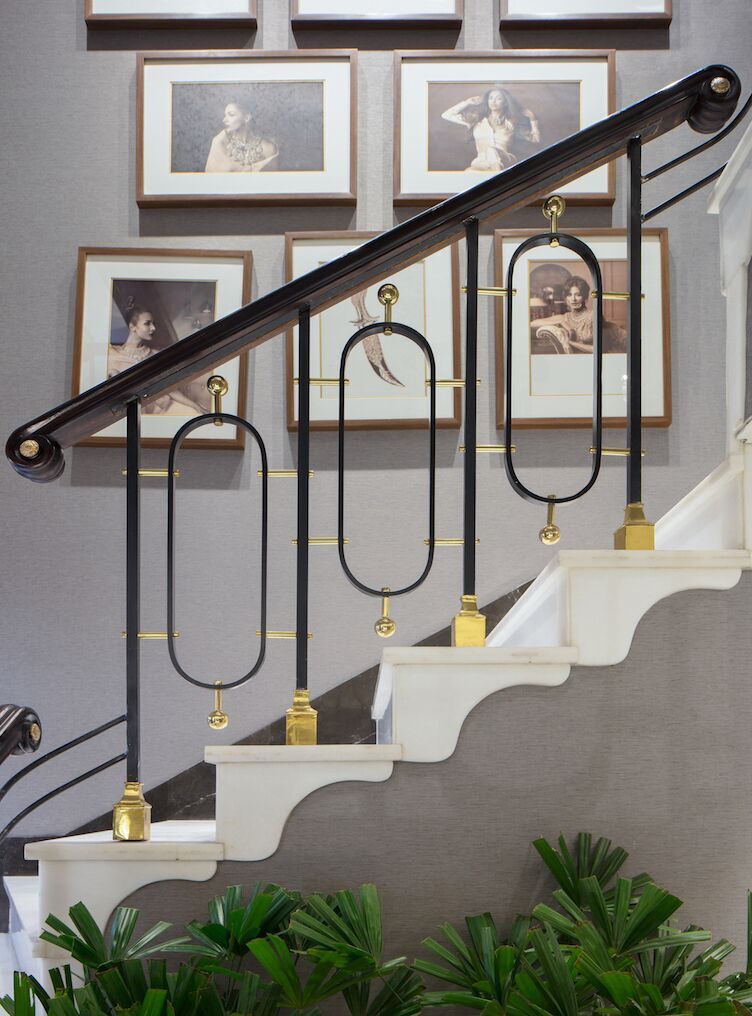
Incorporating attention into designing commonplace element details like staircase railings reinforces the spatial statement. Copper plated stainless steel metal work has been used extensively to enhance stonework on the walls
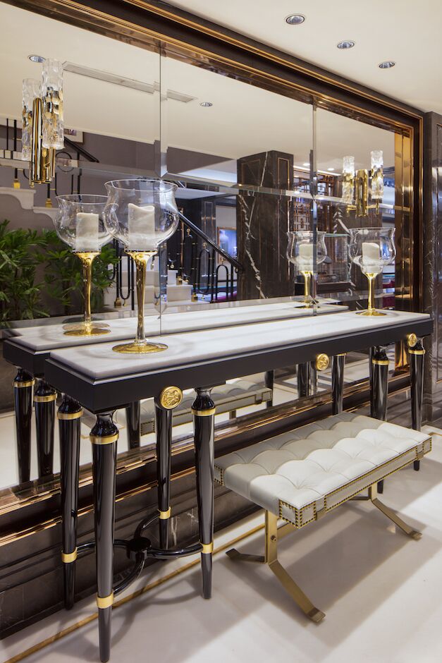
Intricate details like providing a thin band of shining brushed metal in between marble flooring have been worked out to create a chic-effect. Exploration of materials has been pushed to the maximum- the outcome therefore is a grand piece of design, clean, consciously compact and cozy, which successfully elevates the image of Khanna Jewellers.
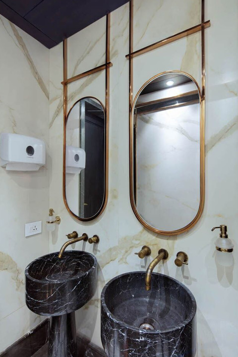
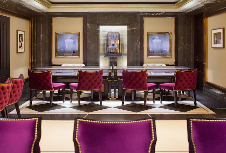
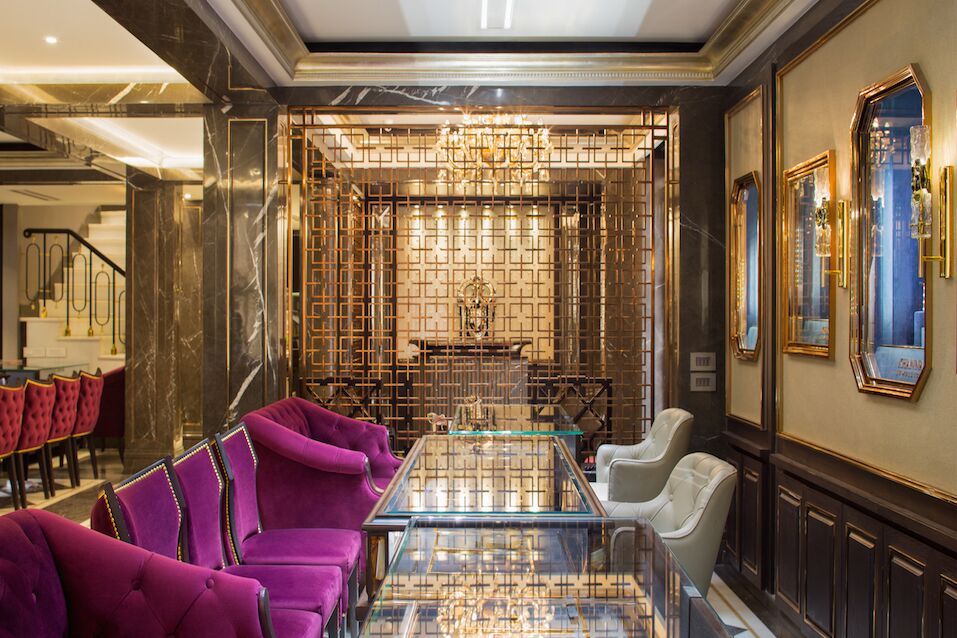
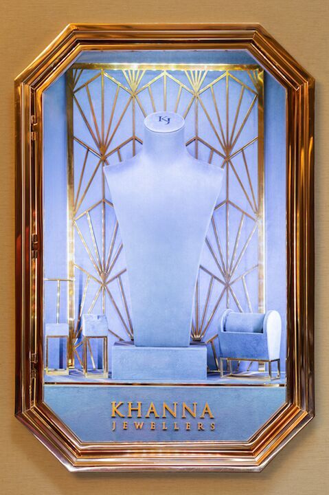
The walls are a combination of crème painted surfaces, boxed inside dark brown wooden reliefs that extend to wooden shelves below. The crème walls are in turn interspaced with deep relief shelves containing dummies to display jewelry. Clad in light indigo velvet, the shelves are encased in glass with glittering golden borders. Vibrant chairs clad in a deep violet velvet finish throw in the necessary spark to the overall spatial quality.
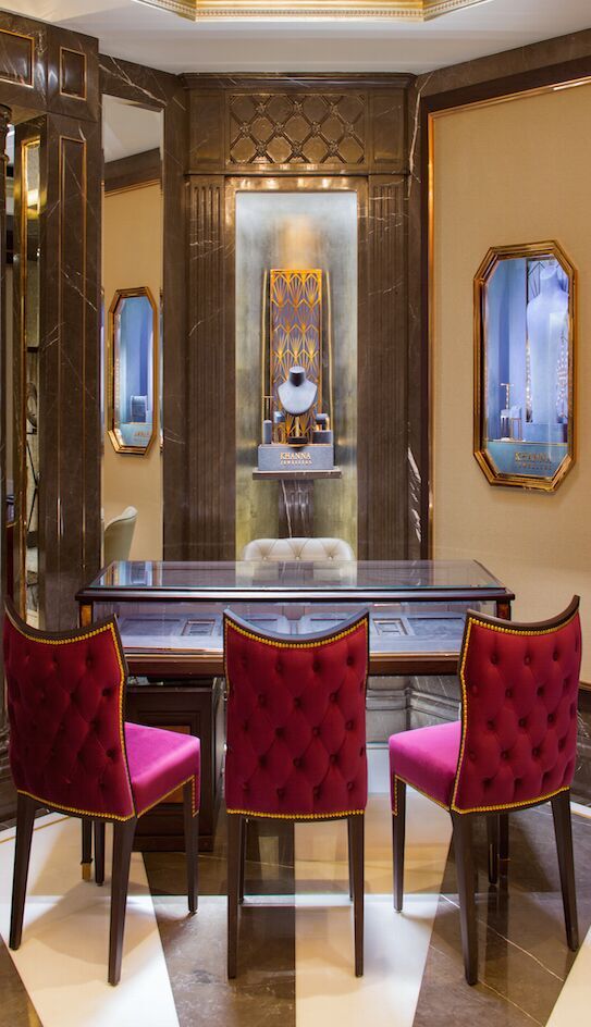
Lights were a crucial part of the design development. Lights that focus on clients escalated the project illumination to the next level. The roof is plain, and despite all lighting services active, none are visible. A plain white ceiling encompassed by a Victorian design champagne gold foil finish cornices allow the theme to flow constantly through the elements.